|
|
Post by Harsh.Realm on Aug 21, 2013 21:31:17 GMT -6
Have an iPad, but I mostly used my laptop, no iPhone, or smart phone, just got a Simple Phone aka (STUPID PHONE).
|
|
|
|
Post by Branjita on Aug 21, 2013 21:51:52 GMT -6
Update: Been making a lot of minor changes to all display types... if you don't notice the changes... then I did my job perfectly... about to call it a day...
|
|
|
|
Post by Gohan on Aug 21, 2013 21:52:53 GMT -6
Go get some well deserved/earned rest!
|
|
|
|
Post by Branjita on Aug 22, 2013 12:04:53 GMT -6
I need to. All the crap I've been doing has been causing me a lot of job stress. I'm pretty irritable!
|
|
|
|
Post by Branjita on Sept 4, 2013 15:58:28 GMT -6
I adjusted the code a little bit, so those of you who use the site on your phones and tablets should hopefully have a little easier time clicking the navigation buttons at the top now. I added some vertical space between links for screen sizes where they form two or three rows of links. Thanks to Gohan for bringing this to my attention, as I wasn't having trouble with it until coincidentally today when I was having a hard time clicking my "Messages" link on my phone today without zooming in and clicking it. I've also increased the size of the page numbers (for when you are looking at a multi-page topic or using the Recent Posts link at the top) and spaced them out a little bit for phone users. Let me know if this helps or hurts your experience here. If it hurts your experience, show me a screenshot and explain why. In addition to those numbers, I also enlarged and spaced out the page numbers for when you look at topics via Recent Threads or via each section of the forum. It's not the greatest looking, but at least now you don't HAVE TO zoom in in order to click the right page number via your phone. Again, let me know if this helps/hurts your experience here as I have not tested this for more than 5 seconds. Also, I can increase the spacing between the page numbers for tablet users too if you guys mention it to me. I don't want to increase the size of the numbers too much for y'all, but the spacing can be done. Just let me know if you want it. |
|
|
|
Post by Gohan on Sept 4, 2013 16:23:44 GMT -6
Hmmm I have a bad eye for things like these lol, umm the top does seem better spaced and the logout is moved a bit up, want a pic of both versions?
|
|
|
|
Post by Branjita on Sept 4, 2013 16:26:55 GMT -6
Sure, post both here, but make sure you are on the Recent Threads page so I can see all three (possible) changes you'll be displaying.
|
|
|
|
Post by Branjita on Sept 4, 2013 16:36:22 GMT -6
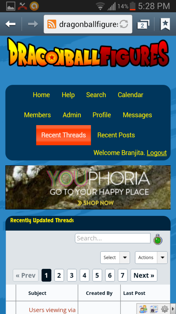
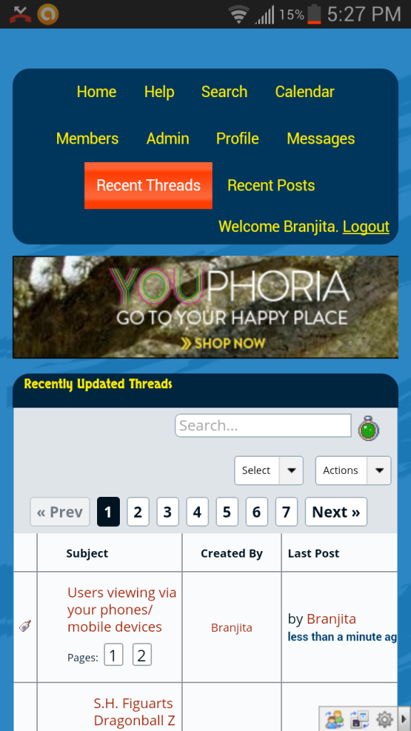
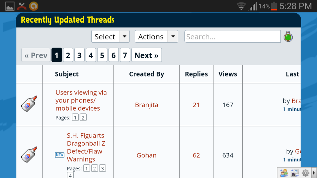
Here's what the changes look like on my phone. I had to take 4 screenshots to show everything. Portrait:   Landscape:   And also, I pretty much only really, really, really reprogrammed things for screen sizes smaller than 600 pixels wide, so I'd cover basically 100% of all phone (and small tablet) users viewing in portrait mode. You'll notice that some things don't fit on my screen in landscape mode, and that's because I didn't concern myself too much with that because it isn't very problematic even with things cut off. I also didn't want to remove columns like I had to do when reprogramming portrait orientation.  Edit: Oh yeah, but what I'm asking you tablet users is if you want the number buttons enlarged and moved further apart from each other. You can see in the last pic that my phone is probably displaying stuff the same way as your tablet is, and those numbers are pretty small, close together, and hard to click. |
|
|
|
Post by Gohan on Sept 4, 2013 19:34:36 GMT -6
|
|
|
|
Post by Branjita on Sept 5, 2013 9:26:26 GMT -6
Do you have trouble tapping the page numbers like those next to the Custom Effect pieces topic on your screen in landscape mode Gohan? Do you want them enlarged or spaced apart more? |
|
|
|
Post by Gohan on Sept 5, 2013 9:30:05 GMT -6
I usually get those right on, with the exception of a bad tap leading to me clicking on the title. They're no trouble for me on landscape, idk about portrait.
|
|
|
|
Post by Branjita on Sept 13, 2013 16:17:03 GMT -6
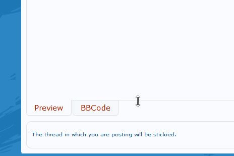
I just made a change to the code that will only affect users who are on large widescreen monitors. I made the quick reply section an extra 100 pixels taller so you can type more than previously and still see everything you said. Also, I was going to change the size of the regular reply box, but I noticed something awesome: you can resize the reply box to be however large you want! You just click and drag on the bottom edge of it. So that's cool, I don't have to redo the programming to make it longer. I find myself having to scroll a lot when I post a bunch of large pics.  |
|
|
|
Post by roshisurprise on May 12, 2014 12:07:40 GMT -6
This is probably going to be one of the lamest questions ever asked on this board but I have to ask it. I have tried doing it for so long but I just do not know how to upload images! I can attach images from my phone but they don't look nice. How do you guys post the images? It's driving me crazy.
Edit: never mind I finally figured it out!
|
|
|
|
Post by Branjita on May 12, 2014 12:43:57 GMT -6
In order to get good quality pics, I upload to Photobucket from my computer after resizing the pics smaller in Photoshop. If I do it from my phone, the quality isn't as good.
|
|
|
|
Post by Gohan on May 12, 2014 15:46:59 GMT -6
I use imgur to post my pics, what did you figure out there roshisurprise? |
|


